Whether the hazard is electrical, toxic chemical or a slippery sidewalk, the best way to prevent injury, death, property damage and litigation is to eliminate the hazard. Since eliminating the hazard is often not possible, the second best method is to place physical barriers between the public and the hazard and to install effective safety signs to alert the public of the hazard.
In Part 1 of this series I discussed the legal ramifications of not complying with ANSI® standard Z535, the American National Standard for Safety Signs Labels and Tags. I also discussed how text font, contrasting colors, letter size, illumination and viewing angle all have a significant impact on sign legibility. These principals apply to all signs including safety signs and menus on the wall of a restaurant.
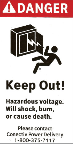
Photo 1. Example of an effective DANGER sign to be placed on the interior of a high voltage transformer
Safety signs must be more than just legible. According to ANSI® standard Z535, safety signs must effectively get the public’s attention, identify the hazard and the severity of the hazard, inform the public of what actions are necessary to avoid the hazard, and inform the public of the probable consequences of not avoiding the hazard.
To accomplish these goals ANSI® standard Z535.2, the standard for environmental and facility safety signs, requires that most signs must be designed with three panels, a signal word panel, a message panel and a symbol panel. Some signs do not have to be three panel signs to be effective. I will discuss those in Part 3. Some signs may be directed to employees rather than the general public. In these cases, if the employees have a higher degree of prior knowledge of the hazard, the sign may not have to be as explicit as a sign directed to the general public.
If the general population in the area in which the sign is to be posted do not read English, signs using the more common language or dual signage should be used.
The Signal Word Panel
The purpose of the signal word panel is to get the public’s attention and to identify the severity of the hazard. The four signal words are DANGER, WARNING, CAUTION and NOTICE. The severity of the hazard is very different for each signal word.
DANGER, in white lettering on a safety red background, always preceded by the safety alert symbol (the exclamation point inside a triangle), “indicates an immediate hazardous situation, which if not avoided will result in death or serious injury.”1 For example, DANGER should be used on a safety signs located inside a switchgear compartment containing parts energized at high voltage. DANGER should also be used on a safety sign at the edge of a pond infested with alligators. The person reading the sign is in immediate danger.

Photo 2. Example of an effective WARNING sign to be placed on the outside of an electric meter socket
WARNING, in black lettering on a safety orange background, always preceded by the safety alert symbol, “indicates a potentially hazardous situation which if not avoided could result in death or serious injury.” 1 WARNING should only be used when the hazard is deadly but not immediate. For example, WARNING should be used on a safety sign located on the outside of the door to a switchgear compartment containing parts energized at high voltage. At the point when the person is reading the sign, the person is not in immediate danger. WARNING should also be used on a safety sign located on the outside of a fence around a pond infested with alligators.
CAUTION, in safety yellow letters on a black background, preceded by the safety alert symbol, “indicates a potentially hazardous situation which if not avoided may result in minor or moderate injury.” 1 The hazard may be immediate but the impact is minor or moderate. For example, CAUTION with the safety alert symbol should be used on a safety sign to alert people of a wet floor or hot exhaust pipe.
CAUTION, in safety yellow letters on a black background, without the safety alert symbol, indicates a potentially hazardous situation which if not avoided may result in property damage. The hazard may be immediate but the impact is only to property damage. For example, CAUTION without the safety alert symbol should be used on a safety sign to alert drivers that there are tire spikes in the pavement to prevent backing up.
NOTICE, in white lettering on a safety blue background, “indicates a statement of company policy that relates to safety of personnel or protection of property.” 1 For example, NOTICE should be used on a safety sign reminding employees of a company policy to wear hardhats in a particular area.
The safety colors referred to in the above signal word descriptions are specific and must comply with ANSI® standard Z535.1, Safety Color Code.
The Message Panel
The purpose of the message panel is to identify the hazard, to inform the public of what actions are necessary to avoid the hazard, and to inform the public of the probable consequences of not avoiding the hazard. For a DANGER safety sign to be located inside a switchgear compartment containing parts energized at high voltage, the message might read:
Keep Out!
Hazardous Voltage.
Will cause death!
(Facility Owner)
1-800-XXX-XXXX
For a WARNING sign to be located on the outside of the door to a switchgear compartment containing parts energized at high voltage, the message might read:
Keep Out!
Hazardous voltage inside.
Can shock, burn,
or cause death.
If found open or unlocked,
please contact
(Facility Owner)
1-800-XXX-XXXX
Note that “Will” is used on DANGER signs and “Can” is used on WARNING signs. For a DANGER sign located at the edge of a pond infested with alligators, the message might read:
Keep Out!
Alligators
Will cause death!
For safety signs on structures supporting electrical facilities, it is better to say KEEP OFF rather than DO NOT CLIMB. I understand that teenage boys, in particular, consider a DO NOT CLIMB sign as a challenge.
The Symbol Panel
“A configuration, consisting of an image, with or without a surround shape, which conveys a message without the use of words.” 2 The symbol panel is particularly important in signs displayed in areas where a high percentage of the public does not read English. The ideal symbol is one that alerts the reader of the hazard without reading the signal word or message panel. The symbol “may represent a hazard, a hazardous situation or precaution to avoid a hazard.” 1 In some cases, a safety sign consisting of only a symbol panel may be just as effective as a three-panel sign. I will discuss those in Part 3.
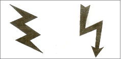
Figure 1. Lightning bolt symbols
The choice of an effective symbol is not easy. That is why the ANSI® standard Z535 committee established a separate standard just to address symbols Z535.3 Criteria for Safety Symbols. Standard Z535.3 requires safety symbols to have a demonstrated understandability. To achieve this, the symbol must undergo recognition testing. The recognition testing involves showing the symbol to hundreds of people, one at a time, and asking them what they think the symbol means. The people must be representative of the people who would be exposed to the safety sign. At least 85% of the people must recognize the correct meaning of the symbol. This is called comprehension.
The other minimum requirement is critical confusion. Critical confusion is when a “safety symbol” elicits the opposite or prohibited action; for instance, when a safety symbol meaning “No Fires Allowed” is misunderstood to mean “Fires Allowed Here.” 2 In order for a symbol to meet standard Z535.3, the critical confusion must be less than 5%, i.e., less than 5% of the people tested perceive the meaning to be the opposite meaning.
Annex B of standard Z535.3 presents details of how to perform the testing. Standard Z535.3 also gives many examples of effective symbols that have been tested many times and passed. Annex C shows some of the commonly used symbols that do not pass the 85% recognition testing. Please note that the lightning bolt symbol commonly used in electrical safety signs, by itself, does not pass the 85% recognition testing.
With this knowledge, most of you can now guess what is wrong with the “”LIVE WIRE”” safety sign I showed you in Part 1.
What is wrong with this sign?
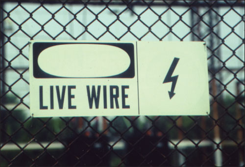
Photo 2. What is wrong with this photo?
1. The signal word DANGER faded away completely. The red paint used for the word DANGER was not protected from the sun’s ultraviolet light so the word faded completely away. Red paints and inks are particularly vulnerable to UV fading. The best way to protect outdoor signs is to have the sign manufacturer coat the sign with a UV protection over-coating, a special clear formula designed to reflect UV. I’ve seen safety signs and labels that were not legible after a six-month exposure to sunlight. I have also seen ten-year-old signs and labels that look new.
2. Since this sign is located on the outside of a fence around a high voltage substation, the signal word should have been WARNING. A person reading this sign is not in immediate danger.
3. The general public does not know what a “LIVE WIRE” means.
4. The general public does not know what the lightning bolt symbol means. This symbol has been tested many times and does not pass the 85% recognition testing.
Please send me your comments on this article. If you have general questions about electricity, electric power distribution or the National Electrical Safety Code® (NESC®), please e-mail me at dave@daveyoungengineering.com or call me at 302-633-1044.
References
1 ANSI® standard Z535.2-2002
2 ANSI® standard Z535.3-2002
National Electrical Safety Code® and NESC® are registered trademarks of the Institute of Electrical and Electronics Engineers® (IEEE®). ANSI® standard Z535.1, .2, .3, .4, and .5 are publications of the National Electrical Manufacturers Association® (NEMA®).






Find Us on Socials